
A lot had happened in the three years since I’d created IBU’s original identity, and the team challenged me to evolve the brand to better reflect what they’d become. The key to the rebrand was to reflect the vibrant personalities of the team who ran IBU, and to update messaging to suit the clarity they now had of their business.
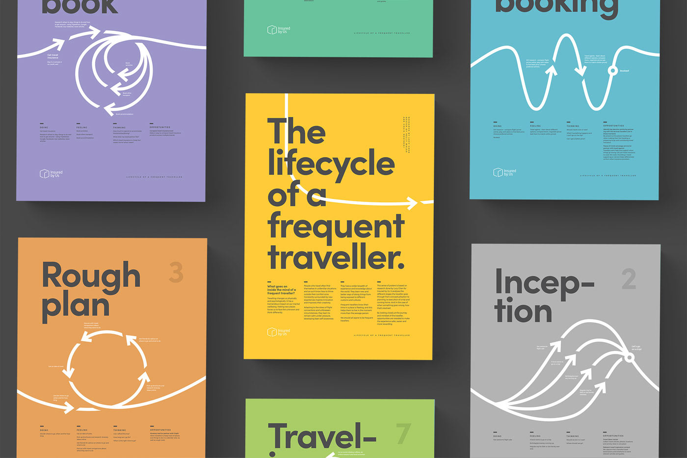
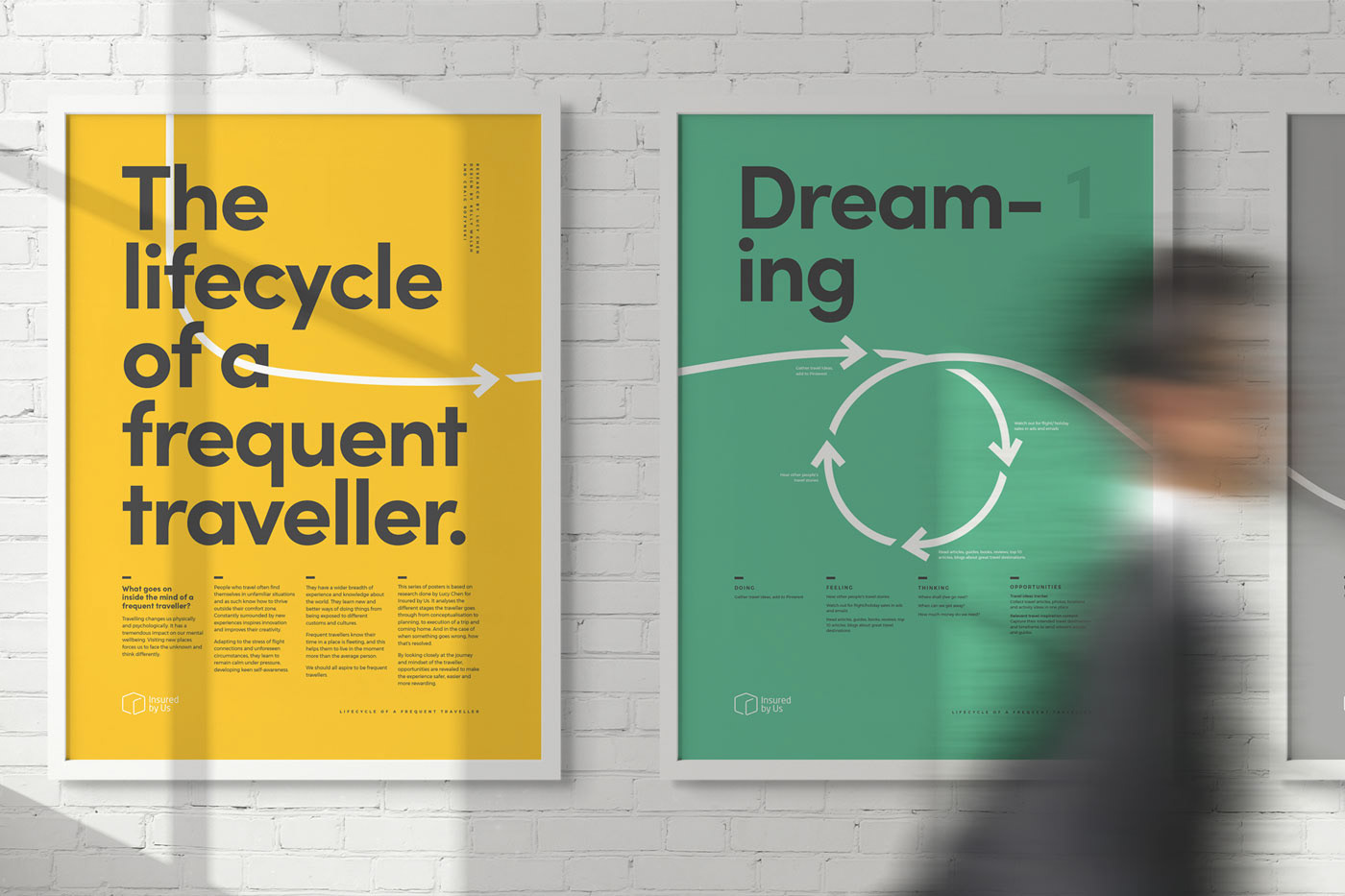
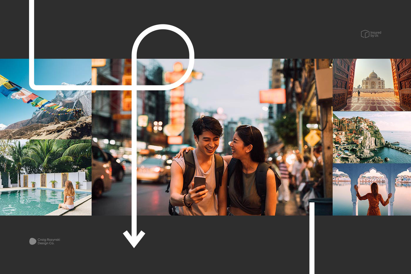
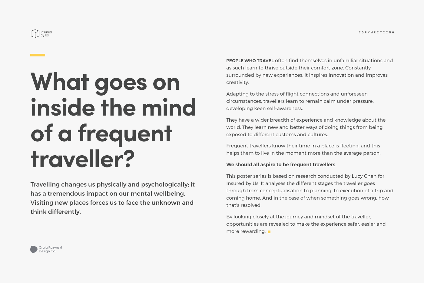
The process began by turning user research conducted by Lucy Chen, which explored the lifecycle of a frequent traveller, into a series of nine posters. These were subsequently hung around their office walls. The monotone colour palette and minimalist typography of old were replaced with a dynamic palette and a bold geometric headline. A thick white arrow representing the journey was used to tie everything together.
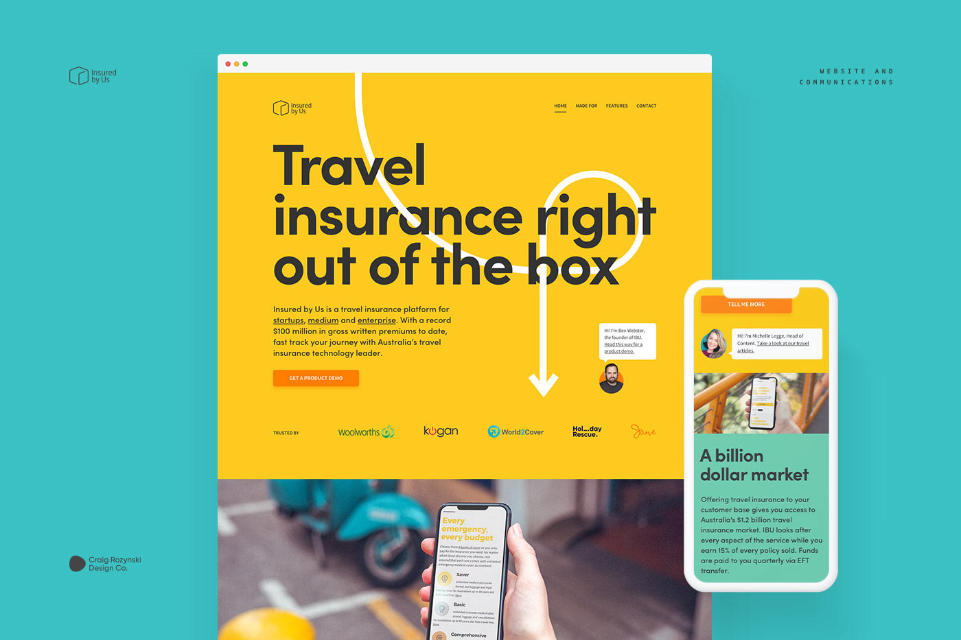
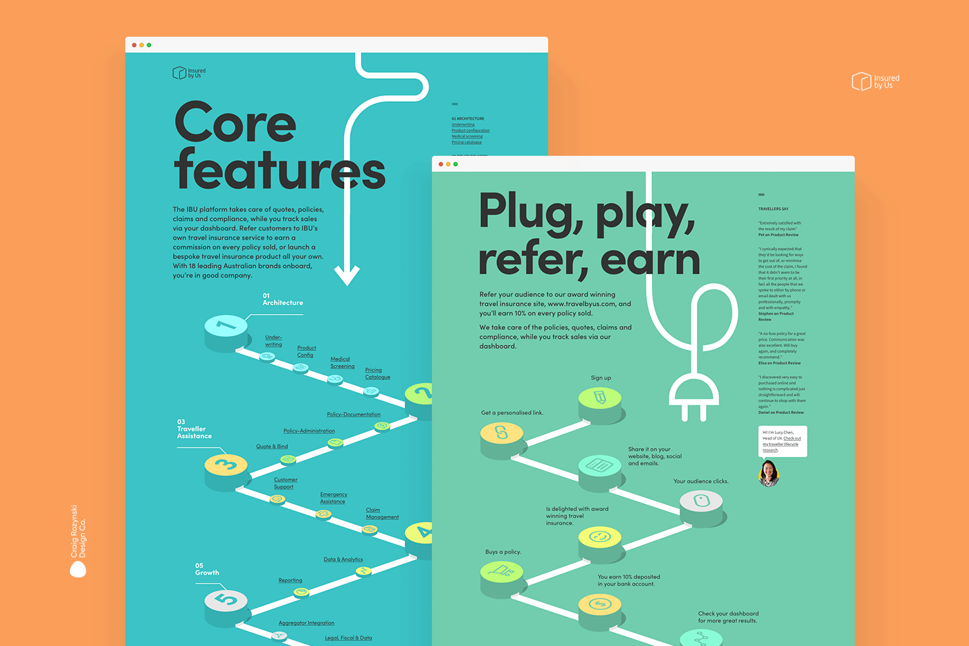
The poster series then acted as a style guide for their rebrand, starting with the website. There was no hiding behind stylish photography on this project – the words took center stage. This required numerous interviews, discussions and rewrites to distill IBU’s communications into succinct messages that cut to the essence of what they offer.
See www.insuredbyus.com for more.